1 (edited by Zammbi 2007-10-31 19:30:58)

Topic: New Gui - Need feedback

We hit a little disagreement while designing the new Gui, so we asking the players for feedback on my current design.

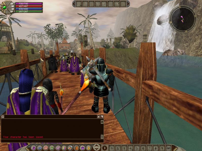
[img]http://www.speedingpc.com/files/gui.jpg[/img]

This image shows the basic Gui layout (ignore the old one underneath)

Top left are the heath, mana, and stamina bars. Hoping to also have a percent number on top.
The green circle is where the map will be. I'll also have it showing north. Also have a button to make it larger.
Currently the size is 800x600.
Chat will be slightly transparent, movable and hopefully resizable and able to minimize it or maybe close it.
Bottom left squares are quick icons for skills or stats.
Bottom middle left square is maybe for showing how many arrows are left.
Bottom middle right square is for showing the current right click skill/spell/etc
The bottom circle buttons for windows which will be: inv, spells, skills, stats/relg, j.p, mail, market, guilds, options.
The options window will have whos online, help, logout, exit.
Gray bottom bar is the xp bar.
Inv, skills, spells, etc in there own movable window which can be closed.
Hotkey to hide map/hp bars.
Hotkey to give an extra 10 quick tabs.

And thats about it for the basic design. We need feedback like if you think this design has blind spots, or will be better to pk with, or too compact, or want other options etc...

I keep my ideals, because in spite of everything, I still believe that people are really good at heart.

2

Re: New Gui - Need feedback

i love this

3

Re: New Gui - Need feedback

Looks pretty good so far.
Maybe not with this server, but something to 'equip' throwing weaps and make it show them next to the arrows orso.
How big will the chat be (how many lines of text). Definatly add something to hide or make the chat smaller incase your PK-ing and and someone attacks from left bottom of ur screen.

4

Re: New Gui - Need feedback

If the new server equips throwing weapons then yea we can add that easy.
Chat is shown about the same height, but as I said I'm hoping we can get a resizable one. Or I will at least add a button to choose a small/large size.
I forgot to say, chat will also be movable.

I keep my ideals, because in spite of everything, I still believe that people are really good at heart.

5

Re: New Gui - Need feedback

if each part was movable it would be awsome, or you could make it based off a XML file or something then each player would be able to move it to whever they wanted them.
You could also have an ingame menu to select the layout(file) that you wanted to use so if someone else creates a layout that the player likes better they can download it and use it.


It woulb be nice also if there could be multiple sets of quick icons and switch them by pressing F1-F9 or something similar

6

Re: New Gui - Need feedback

All windows are based on XML files in the new client.

7 (edited by Zammbi 2007-10-31 19:42:12)

Re: New Gui - Need feedback

Well for people who think the heath bar and the map will get in the way, there could be a button the quickly removes them and maybe any other window on the screen for quick combat.


Also, from an efficiency perspective, it seems like the more compact design has some advantages.  Consider a person walking along a river fishing  and lumberjacking (as I often used to do).  With the old GUI I would switch to my skills tab and it was just a single click to switch between the skills.  In the new system, you either have to leave an additional window open while you walk, or have to double your clicks (as it doesn't make a huge amount of sense to hotkey fishing and LJ in most cases, since there are other abilities you need much more urgently).

I'm not sure if I understand what your saying. Are you saying the new system will double you clicks? well I guess if you didn't like any windows(Though there be room now since its 800x600) on screen it would be 1 click to open the window, 1 click to pick the skill and 1 click to close. Why not hotkey it? Currently it shows 10 hotkeys (current client is 8), but with a press of a button like alt it will show another 10 or so.

I keep my ideals, because in spite of everything, I still believe that people are really good at heart.

8

Re: New Gui - Need feedback

I see. Well as the screen is now 800x600/slimmer gui, there will be room to leave the small skills window open and still able to see a lot of the screen, would be way more then the current client with nothing on the screen.
Anyway I haven't plan how the windows going to be yet, thats kinda the next step.

I keep my ideals, because in spite of everything, I still believe that people are really good at heart.

9

Re: New Gui - Need feedback

Mouse wheel support for everything.  I'm not sure if this has been mentioned or is taken for granted, but for me this has always been a very important feature.

10

Re: New Gui - Need feedback

Yea seems everything has mouse wheel support. Also every button/input can be tabbed too...

I keep my ideals, because in spite of everything, I still believe that people are really good at heart.

11

Re: New Gui - Need feedback

Might be a slight change, I might add the map and the bars to the bottom tab.

I keep my ideals, because in spite of everything, I still believe that people are really good at heart.

12

Re: New Gui - Need feedback

I was idly browsing another rpg forum, got linked to a comparison site and randomly spotted a screenshot from Rubies of Eventide: http://www.gameogre.com/reviewdirectory … entide.jpg

Someone been gathering ideas from the competiton ^_^

The new GUI seems to have a rather larger visible area around the character anyway so thats good in my book.

I'm not personally convinced that a map in the top right is best, I'm quite used to a bottom left radar screen in several games as the bottom is where stuff you often check on like ammo and health usually lives.

13

Re: New Gui - Need feedback

in that last post i love the way they display the exp in a bar as well i hope faldon can introduce this.

14

Re: New Gui - Need feedback

One little thing - can the places where you put the quick skills/spells have a little number in a corner or something so that you know what the corresponding number key for a skill is easily.

15

Re: New Gui - Need feedback

Marlborough wrote:

One little thing - can the places where you put the quick skills/spells have a little number in a corner or something so that you know what the corresponding number key for a skill is easily.

That has been mentioned.  I think it's a good idea.